


Modular design and cross-team collaboration.
Jinri Toutiao - World Cup Channel
将二十位解说员的内容以品牌化视觉形式呈现,打造解说团队的专业认知
镜像半身像,模拟面对面辩论场景,强化解说内容的对抗感
深度呈现解说内容


将二十位解说员的内容以品牌化视觉形式呈现,打造解说团队的专业认知
结合具体内容,以更具对抗感的形式呈现,丰富解说内容的观感
可视化展示专业数据


延续球迷对纸媒杂志的怀旧情结,分类球衣颜色并以背景色点缀,区分赛事同时,还原了球场的激烈氛围,通过调用内部海报工具,推动设计方案高质量上线
有张力的视觉设计

贯穿完整赛事阶段的动效,渲染赛事氛围


四套基础动效模版(开赛,强强对决,明星球员,夺冠),通过简单替换图片素材即可快速上线,有效弥补图文体裁在情绪渲染上的短板

根据不同的赛事阶段,灵活调整设计思路
用稳定的页面框架,可变的内容模块顺序
预热与余热期内容少、深度球迷为主,适度外露引导阅读;比赛期信息多、泛球迷为主,压缩呈现强化筛选;头部稳定的框架兼容各体裁和内容,培养稳定的用户心智,在不同阶段都能快速找到重要内容
Get the Highlights
Modular animations cover the full tournament timeline and delivering immersive atmosphere.
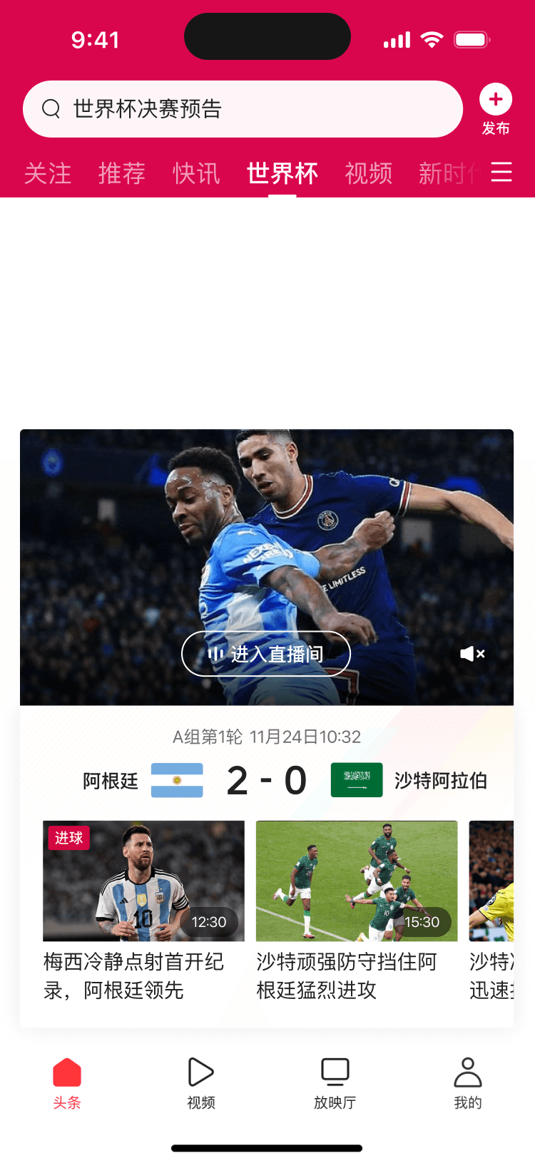
频道头部:重要比赛

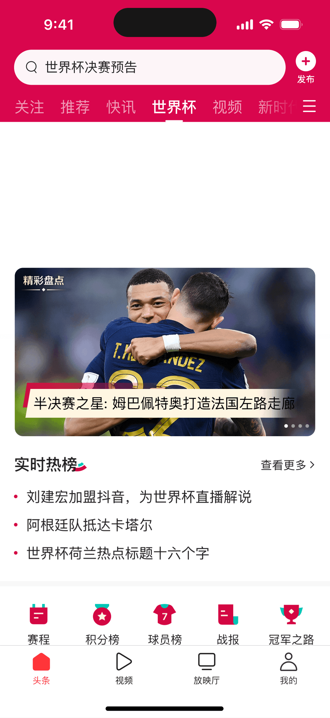
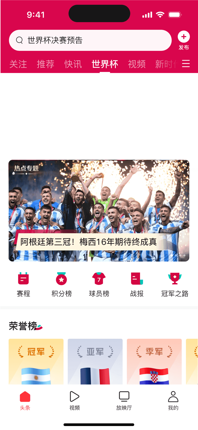
频道头部:夺冠
Four base animation templates (opening, battle, star players, finals) enable rapid deployment by simply replacing image assets, allowing instant launch and timely referencing of trending events to immerse users in the atmosphere.
频道头部:开赛

频道头部:明星球员出场

Evoking nostalgic emotions through a print-magazine-inspired style.Jersey colors are used as category markers and extended into background gradients, visually separating match types while recreating the intensity of the pitch.
Visual design balancing order and tension.


A clear, stable page structure with flexible content ordering.
It establishes a consistent user mental model while adapting to different event stages. Warm-up and cooldown phases focus on consumption for dedicated fans, while the competition phase prioritizes filtering for casual fans, guiding users from overview to depth.
Content from twenty commentators is presented through a cohesive, branded visual system that conveys credibility.
Mirrored half-body portraits simulate a face-to-face debate, reinforcing the sense of contrast and opposition in the commentary.
Present expert commentary with strong authority.

Font embedding previously led to oversized package sizes, and manual poster creation was both time-consuming and error-prone. By integrating the internal smart poster generation tool, operations teams can now generate high-quality in-app posters simply by uploading a title and cover image—reducing manual workload and ensuring timely content delivery.
Utilize internal tools within backend systems.
Coordinate upstream and downstream workflows.
Upload the cover image to the internal backend
Input the title
Automatically generate the poster with correct team colors – done
After integrating poster tool into backend
Import the cover image into Photoshop
Select the matching color template based on the teams
Input the title
Export the poster from Photoshop
Upload the poster to the backend – done
Original workflow
Major trending events bring both growth and challenges.
Diving in the topic and users is the key
Quick onboarding
Brainstorm with football fans
Collaborated on page structure


Rapidly built football knowledge
Analyzed user needs across different match stages.
Co-design with Product and Operation team
Major trending events can significantly boost Toutiao’s DAU. However, with limited time and diverse topic, they require rapid insight into both users and content. During the World Cup, this posed an even greater challenge for designers unfamiliar with football. We addressed this through intensive onboarding and co-creation sessions, quickly closing knowledge gaps in the sport domain.


Define Design Target
Based on content form and users’ need
深度,
看得爽。

Easy to understand
Clear.


Satisfying to read.
Insightful.

Filled with atmosphere.
Vivid.

Clear.
Easy to understand.
Clear and intuitive interaction and layout, ensuring quick and easy understanding for casual fans.


A stable header for every stage.
Consistent structure. Adaptive content.
The unified header layout accommodates different content formats across stages—such as matches, analysis, shows, and content hub. Key information in each stage stands out clearly, helping users quickly locate what matters and reinforcing a stable mental model.
Predict before the match
Watch during the match
Match preview
Live entry + highlights
Match Recap + highlights
Reflect after the match


Excerpt key insights
for quick scanning.
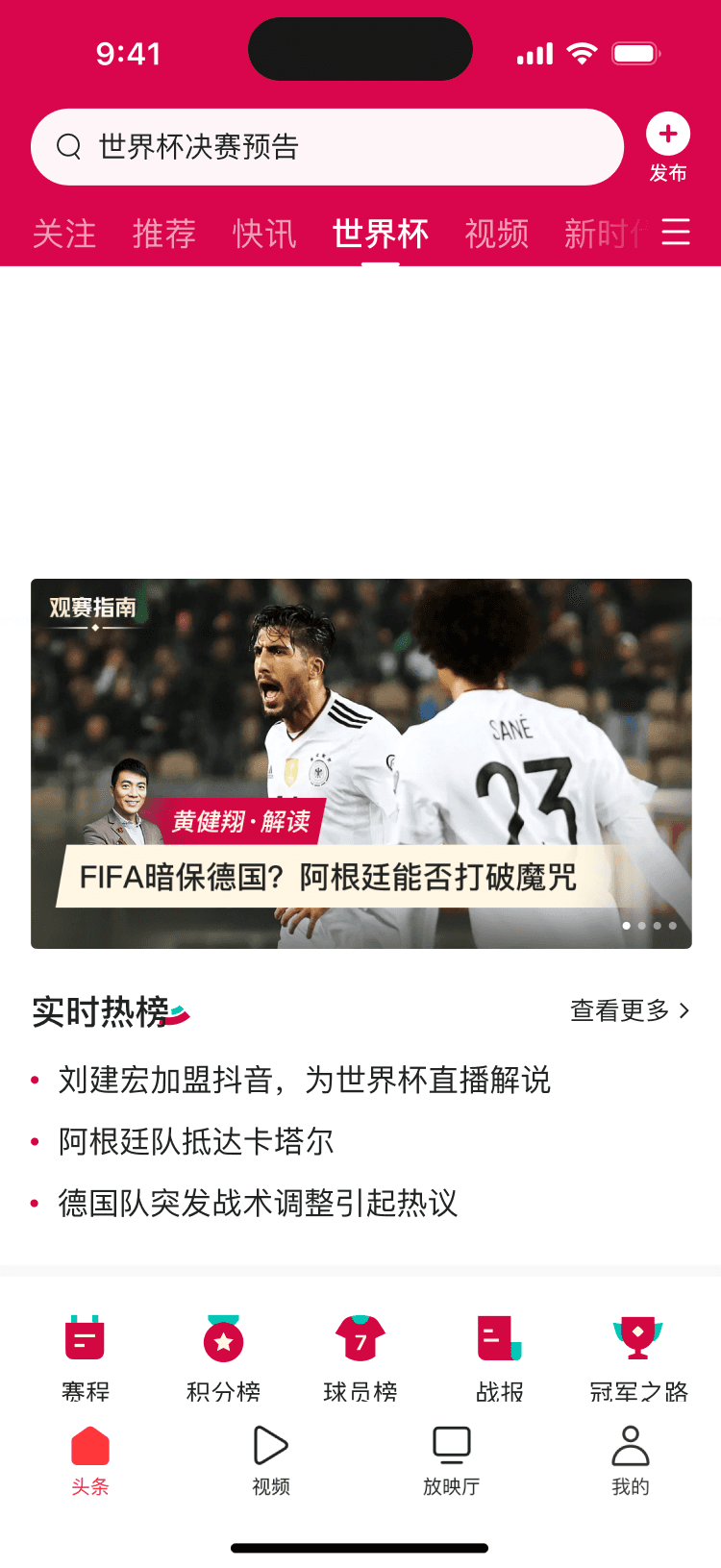
Summarized views from three senior media experts, paired with concise headlines to help users quickly scan the match’s key takeaways and build a clear framework for deeper understanding.


Concise entry
A plain, easy-to-grasp,
one-sentence commentary
Thoughtfully selected by the ops team to help casual fans easily grasp the game’s key point.
Take the path to viewing expert commentary as an example
From basic to advanced
Prioritize casual fans’ needs
Progressively reveal professional content
To serve casual football fans, the content is first presented in a simplified, easy-to-understand format during the tournament. Deeper insights like match data and expert analysis are placed on secondary layers for advanced users to explore at their own pace.
Tap the banner
Entry the Match Preview Page
Enable users to dive deeper into expert analysis and insights, meeting the reading needs of delicated fans.
Tap view more
Entry Match Insight page
Full expert commentary
for in-depth insights.
Progressive structure.
Multiple rewatch options tailored to user habits.
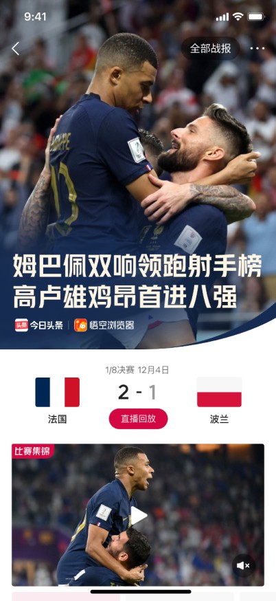
On the Match Recap page, considering most casual fans won’t rewatch the full match, we offer layered viewing formats to tailored different level of users’ need.

Understand the match in seconds with a single, simple line.
One-sentence commentary
The most popular format. Quickly replay the key moments of the game.
Video highlights
Visual-rich analysis with in-depth breakdowns of both teams’ tactics.
Match analysis article
Track the full flow of the game and grasp the critical turning points.
Timeline of key events


During the group stage, 32 teams play 48 matches in total. From the overwhelming stream of event updates, we select the most talked-about games and highlight their key moments to help users focus faster and reduce the effort of scanning through everything.
Simplify the clutter.
Help users get the highlights

Considering casual fans’ interest in star players, we highlight key match moments related to them at the top to draw user attention.


Insightful
Satisfying to read
Emphasize high-quality content to meet the needs of dedicated fans.

Present expert commentary
with strong authority.
Commentary content is a key differentiated asset of the platform. The operations team curated a group of 20 professional commentators with diverse styles to address various user needs. Through branded visual design, the professionalism and authority of the commentary are emphasized, enhancing user trust.
Cultivate a unified and authoritative commentator identity
Standardizing both visual and content presentation.
Unifying half-body portraits and background, Resolved issues of inconsistent visual styles and fragmented verification caused by native design form, strengthening brand recognition.
Native Design
Branded Design
Dedicated fans have clear preferences for commentator styles. Large avatar designs help quickly identify preferred commentators.
Compared to the previously lengthy full text, the optimized layout provides concise titles that allow quick scanning of each commentator’s key perspectives.

Stand out with confidence.
Subtly shape a sense of expertise

A dedicated page introducing the full commentary team in detail.

Each viewpoint is labeled with the corresponding commentator.

The shared poster highlights the expert lineup.

Expert lineup prominently displayed at the top of the match preview page.
Clever use of symmetrical layout
Highlights confrontation while giving equal weight to both sides’ perspectives.

Mirrored half-body portraits and debate-style layouts.
Enhancing the sense of rivalry.
Commentators facing the audience
Appear to speak evenly to users.
Commentators facing each other.
Red and blue background blocks visually reinforce confrontation.


Symmetrical layout everywhere.
Ensures informational neutrality.
As a neutral information platform, Toutiao focuses on gathering facts rather than taking a stance. The symmetrical design allows opposing perspectives to be equally visible, reinforcing an objective and balanced view.
Visualized data presentation
Simplified and refined stats to support in-depth analysis for dedicated fans.


Distill key information
Use more intuitive visual language
Visualize on-field space
Conventional design
Squad data comparison
Team shooting positions
Team formation layout
Player heat map
Team performance comparison
Display abstract data with progress bars to improve readability and facilitate comparison.
Display spatial data with pitch-based visuals to support clearer tactical insights.
Helps users quickly sift through dense data, making key information instantly clear.
Visualized design


Compensate for the emotional limitations of text-based content and enhance the match atmosphere.
Vivid,
Filled with atmosphere.
Extending fans’ collective memories.
Recreating the visual experience of print magazines.
User research revealed that print magazines played a vital role in shaping a generation of football fans. The bold layouts and visually striking graphic design formed a part of their collective memory and nostalgic attachment. Inspired by this, the visual style was defined to echo that emotional legacy.


From skeuomorphic to flat.
A visual language aligned with Toutiao’s brand tone.
我们根据球队的球衣颜色划分了用色标准,保证每场战报


UX Proposal
Skeuomorphic details as visual accents
Final UI Design

Skeuomorphic design best recreates the viewing experience of print magazines, but it clashes with Toutiao’s overall flat visual style. Excessive textures and shadows also risk overwhelming the content, making information less immediately accessible. In the final direction, we adopted a flat design approach, using bold graphics and colors to create visual impact, while preserving select skeuomorphic details as subtle accents that do not interfere with core content display.


Sense of impact
Sense of order


Balanced visual design.
Order and impact in harmony across user scenarios.
For search and browsing scenarios, an orderly layout highlights key information, enabling users to quickly locate their content.
For top-of-page and event-focused scenarios, strong color and image contrast creates a striking visual impact that reinforces atmosphere.
In World Cup photography, the colorful jerseys often stand out visually. To enrich the scene, we got inspiration from jersey colors, categorized teams by their color schemes, and selected five iconic palettes as highlights to bring more vibrancy into the visuals.
A splash of color on the field.
Inspired by the vibrant palettes of team jerseys.


Bright gradients overlay stadium photos on each recap cover to instantly convey the atmosphere. Distinct accent colors are used per match to highlight its character, creating both visual freshness and clear segmentation.
Vibrant match recaps
Color gradients amplify intensity
Utilize internal tools.
Embedded into the internal backend to reduce workload and ensure quality.
To achieve the header poster effect on the match recap page, we initially tried embedding custom fonts into the client, but this caused excessive app size.Shifting the task to operators—manually editing posters in design software—led to long workflows and frequent errors.
We ultimately integrated an internal poster generation tool into the backend. Now, operators only need to upload a cover and input a title to generate a high-quality poster ready for client delivery—saving time, reducing errors, and ensuring timely content distribution.
Original workflow
Import the cover image into Photoshop
Select the matching color template based on the teams
Input the match title
Export the poster from Photoshop
Upload the poster to the backend – done
After integrating poster tool into backend
Upload the cover image to the internal backend
Input the match title
Automatically generate the poster with correct team colors – done
Behind the scenes


Homepage Doodle – Final
Channel header – Kickoff
Channel header
Star players take the stage
Channel header
Championship victory


Homepage Doodle – Kickoff


Channel entry

Channel header – Battle
Channel header – Key match
Motion design is applied across platforms
to compensate for the limited emotional expressiveness of text form, reinforcing a competitive atmosphere.
Dense motion design
Enhances emotional engagement
11.20

11.22

11.23

11.27

12.15

12.17

12.18

12.19

12.14

12.10

12.09


12.01

11.28
Four animation templates
Cover full match timeline and enhance emotional engagement
We predefined user emotions across key match moments and created four base animation templates that cover most scenarios. By simply replacing image assets, each template adapts to different matches—greatly reducing design and engineering workload, accelerating delivery, and ensuring motion content stays aligned with the match tempo.
Contextual voting interactions
Regulation-compliant formats extend engagement
Pre-match: Vote for your team
Post-match: Vote for best player


Considering users’ strong interest in match gambling, we designed voting interactions before and after each match. Traditional prediction mechanics were replaced with compliant formats to extend the sense of engagement. This design aligns with the match flow while increasing user participation.
Custom emoji packs
Enhance interaction and enrich discussion
Based on fan commentary and internal vote results, we created a set of custom emoji—ranging from broad celebratory expressions to club-specific designs for hardcore fans. These assets make comment sections more expressive and engaging, while strengthening the sense of community.

The World Cup channel was launched with high quality thanks to close collaboration across design, product, operations, and engineering. Key metrics—including retention, acquisition, and reactivation—exceeded expectations, while user satisfaction remained high. The project also laid a solid foundation for future major sports event designs.
© Qicheng Hsu. All rights reserved.
View More Projects


© Qicheng Hsu. All rights reserved.