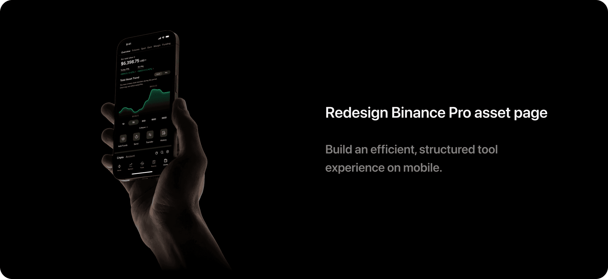
Combing usability with visual elegance.
Redesign
the MetaMask brand

Web3 starts with MetaMask.
For many, it ends there.
Extra cost from offline storage drives users away.
Costly Preparation
Poor Usability
Untrustworthy Visual
Inconsistent branding and interface weaken trust.
Unclear flow complicates wallet creation.


Redefinition.
For a new experience.
Reimagining what a first-time Web3 experience should be.

Safe

Clear

Effortless


Before

After
A complete redesign.
Transforming inside and out.
Strengthen brand consistency to build trust
Redesign flows around the user journey to reduce drop-off
Refine interfaces to deliver clarity and usability

Inspired by guardianship.
A new brand built on safety.
Drawing on the heritage of the stone lion, the new identity stands for vigilance, reliability, and protection.
From blank to watchful.
Protection at a glance.

Replace the outdated low-poly logo with a single-color minimal form, which delivers freshness and improves recognition. Sharp angular contours carve out the fox’s shape, and the gaze expresses a sense of vigilance and protection.


Freshlime Yellow
A bridge of brand continuity and safety.
As the midpoint of the original brand orange and the original UI blue, mint yellow continues the brand’s warmth, slightly leans toward green for a sense of safety, and unifies brand and interface colors.
Previous Brand Color
New UI and Brand Color

Previous UI Color

Redesigned the flow.
Built for every step.
User State
Design Target
Establish trust: use a consistent brand and visual language that conveys security.
Set expectations: explain required materials, estimated time, and outcomes.
New users lack trust and don't understand the set up.
Before wallet creation
Keep focus: reduce distractions and extra navigation.
Guide clearly: provide clear commands at each stage.
Simplify terms: use plain metaphors and visuals to explain.
Encourage completion: remind benefits when users want to quit midway.
Unfamiliar terms and a complex setup cause drop-off.
During wallet creation
Provide Clear feedback: confirm wallet creation and safety.
Offer contextual reminder: emphasize safe backup and storage practices.
Users feel accomplished but may neglect backup and offline storage.
After wallet creation

From Developer-centered
To User-centered
The new brand identity and cohesive palette shape the first impression,establishing a consistent tone across the experience.
Launch APP
Sign UP


Freshness.
Made for first sight.
Set expectations upfront

Remind users to prepare offline storage in advance to avoid disruption.
Present the three-step setup to give a clear sense of scope and time.
Motivate users to complete by emphasizing long-term protection of assets.
Explain before setup.
Passwords and seed phrases are often confused, so explain them with familiar language and intuitive visuals.
Turned vague visuals into meaningful metaphors, using familiar everyday objects to help users grasp the true role of the seed phrase.
Step 1 - Set Password
Step 2 - Introduce Seed Phrase


From visual noise to understanding
Before
After
Using clear and concrete visuals instead of vague, lengthy text to give users clear guidance.


Before
After
Enough with the nonsense.
Straight to the point.


Before
After
Provide clear and accurate command to users
Detail in progress bar design
Balancing clarity and pressure
Creating a wallet includes three main steps. To help users understand seed phrases, two info screens are added, bringing the total to five transitions.

Showing 3 main steps while 5 transitions exist creates confusion and impatience.

Showing all 5 transitions makes the flow feel lengthy and discouraging.

Keeps three main steps, with two guidance screens nested under step two. Balanced, clear, and less pressure.
Stay Elegant
Even in warnings
Allow users leave
but give them reasons to stay
Before
Pop-up alerts disrupted the flow, stacked layers cluttered the interface and distracted users.
A cleaner, less disruptive way to handle screenshot alerts
Inline alerts lower visual clutter and keep the flow focused; regeneration option protects the seed phrase.
The original flow lacked an exit, while the new design adds retention by highlighting benefits
After


Simple to use
Simple to finish
Before
Before
After
After


Confirming all words requires many clicks, and the small button areas make it hard to operate.
Concise end-of-flow message confirming wallet security with backup reminders.
Vague and lengthy text without clear guidance.
Confirming random three phrases simplifies the task and still ensures users have saved them.
Let illustrations teach
Not just decorate


Before
Decorative illustrations with mixed styles cause distraction. Incohesive styles mixed emojis, flat icons, and abstract 3D, making illustrations feel random and distracting from key content.
After
Meaningful Illustrations with cohesive style help better understanding. Familiar objects in a consistent soft 3D style grounded abstract concepts, bringing clarity and making Web3 easier to understand.
View More Projects


© Qicheng Hsu. All rights reserved.